INDUSTRY:
FIELD SERVICE SOFTWARE
ROLE
PRODUCT DESIGNER
SERVICE
USER RESEARCH, USER EXPERIENCE, USER ENGAGEMENT, ONBOARDING
TIMELINE
DEC. 2022 - PRESENT
OutSmart
Power up your business
about.
OutSmart is a smart digital environment designed to streamline work order management for medium to enterprise field-service businesses. By replacing traditional paper workflows with a structured, digital environment, it empowers service companies to work more efficiently, stay organized, and reduce their environmental footprint. OutSmart blends innovative tools with a human-centered design philosophy, making it the all-in-one solution for field-service operations.
challenge.
OutSmart faced multiple product experience challenges that held back its growth and user satisfaction:
New users dropped off quickly due to an unclear, untrustworthy onboarding and registration flow.
The platform lacked structured onboarding, leaving users unsure how to set up and use key features.
Subscription and purchasing flows had become fragmented, cluttered, and disconnected from user expectations.
Key mobile tasks were buried, making the iOS experience frustrating for technicians on-site.
How could we build a software for trust, efficiency, and clarity across onboarding, product use, purchasing flows, and on-site operations while ensuring the experience remained scalable and modular?
approach.
To address these problems, I conducted research with both external and internal stakeholders. I validated information with the service desk and customer success departments, and brought in user feedback loops to understand friction across the platform. Stakeholders and I analyzed current flows, identified usability bottlenecks, and created detailed user journey maps.
By combining these qualitative insights with hands-on user testing, I was able to redesign flows and interfaces grounded in real usage patterns. I collaborated with developers, product owners, and other departments to implement improvements that would not only solve issues but drive long-term scalability.
results.
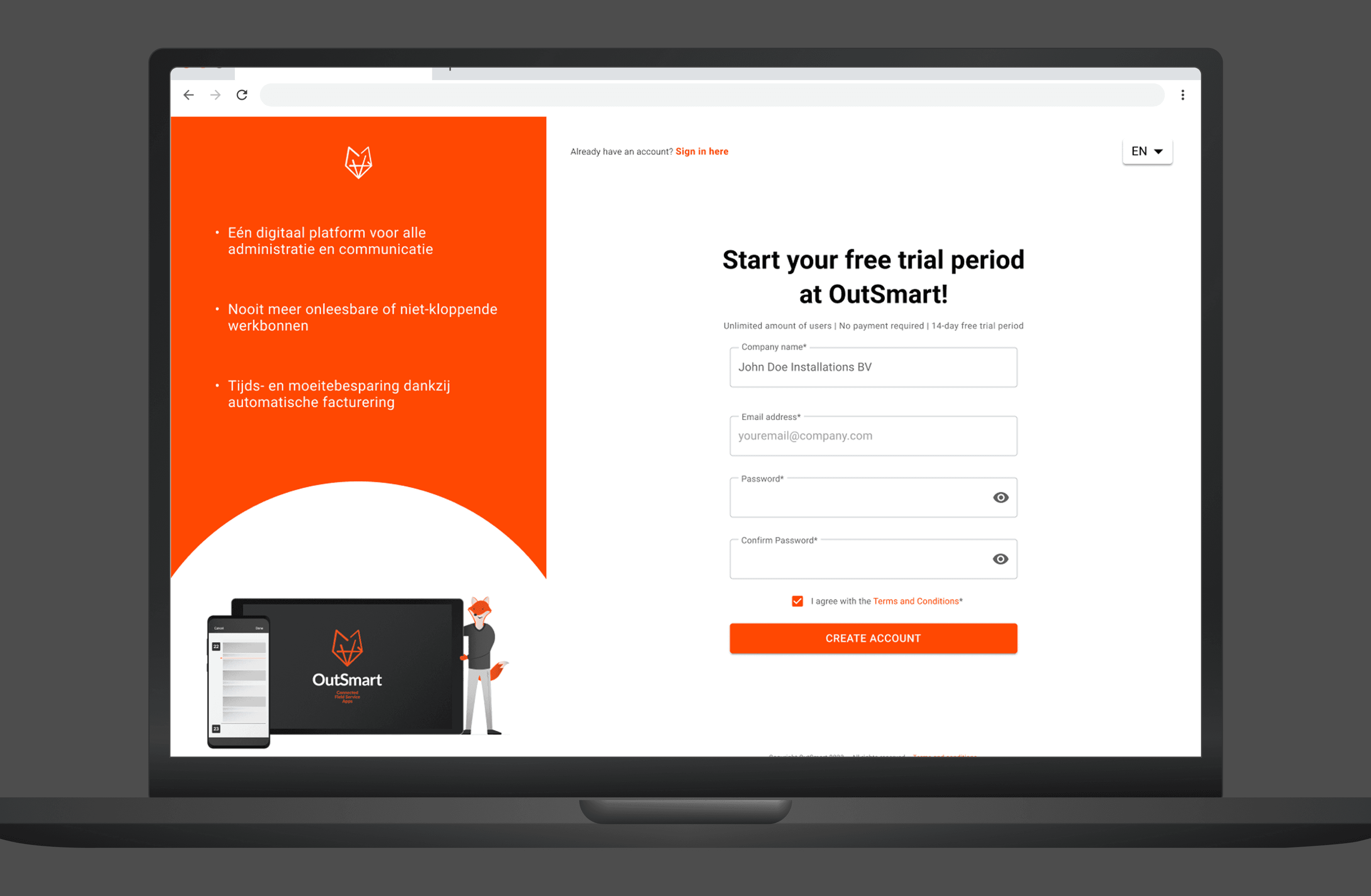
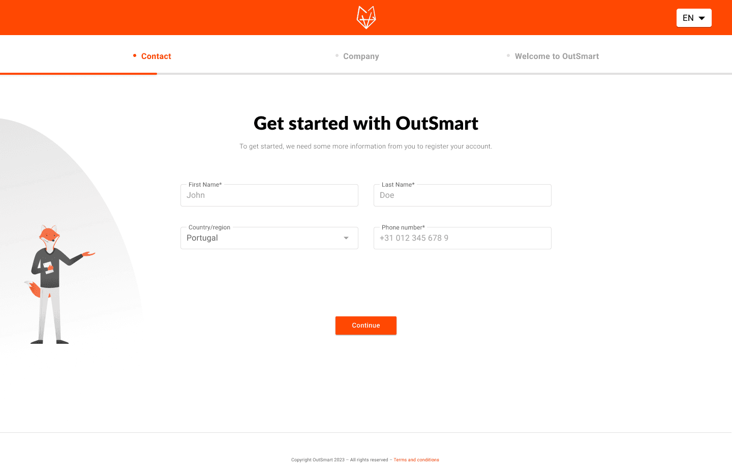
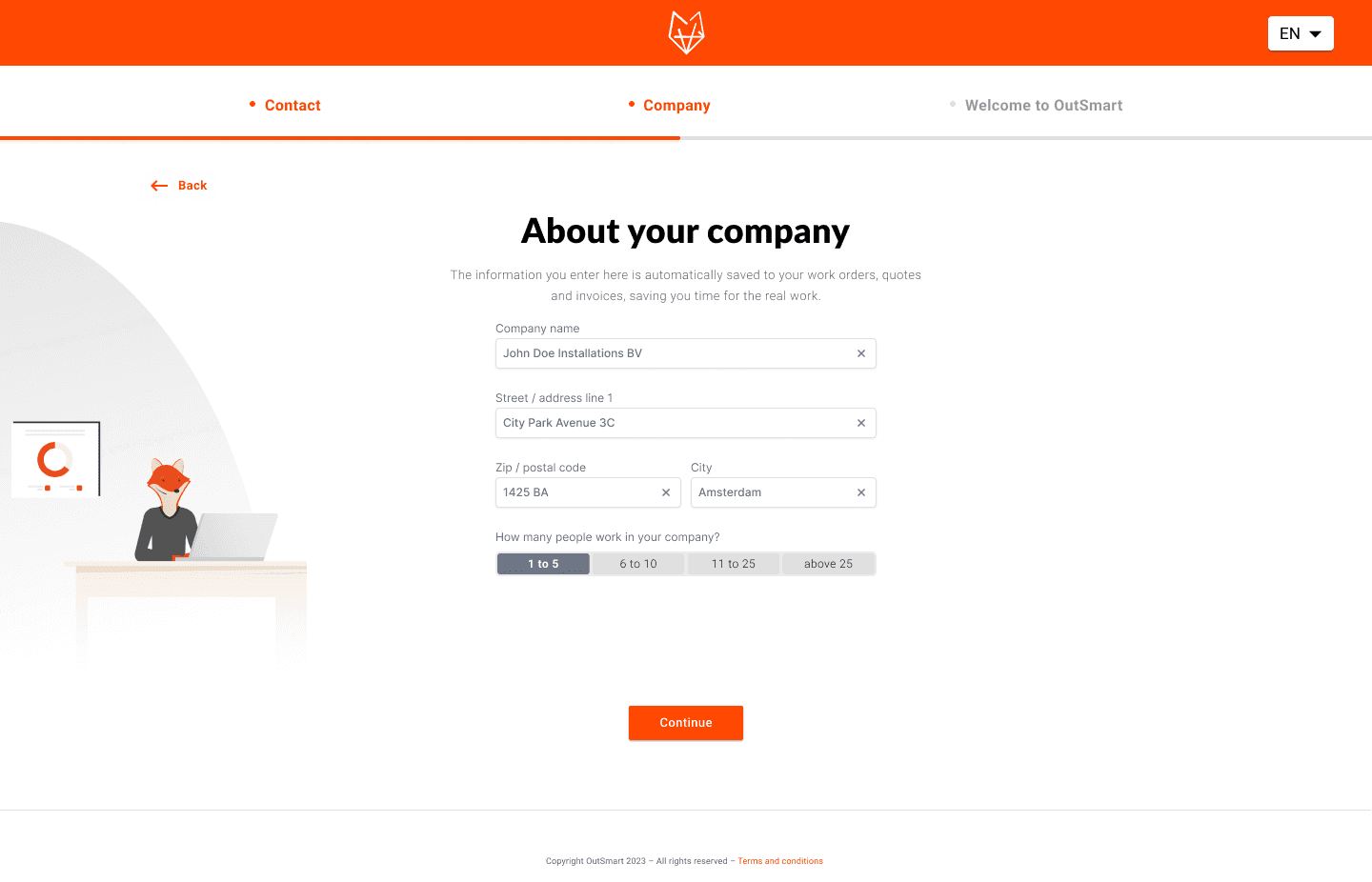
Improved user registration
The original registration flow felt invasive and lacked clarity, leading to early user drop-off before even exploring the platform. By redesigning the flow into a calm, step‑by‑step experience with concise fields and messaging we established trust upon first interaction.
As a result, users understood value propositions earlier and felt confident sharing their personal and company information. This resulted in usage of the product with a stronger sense of purpose.
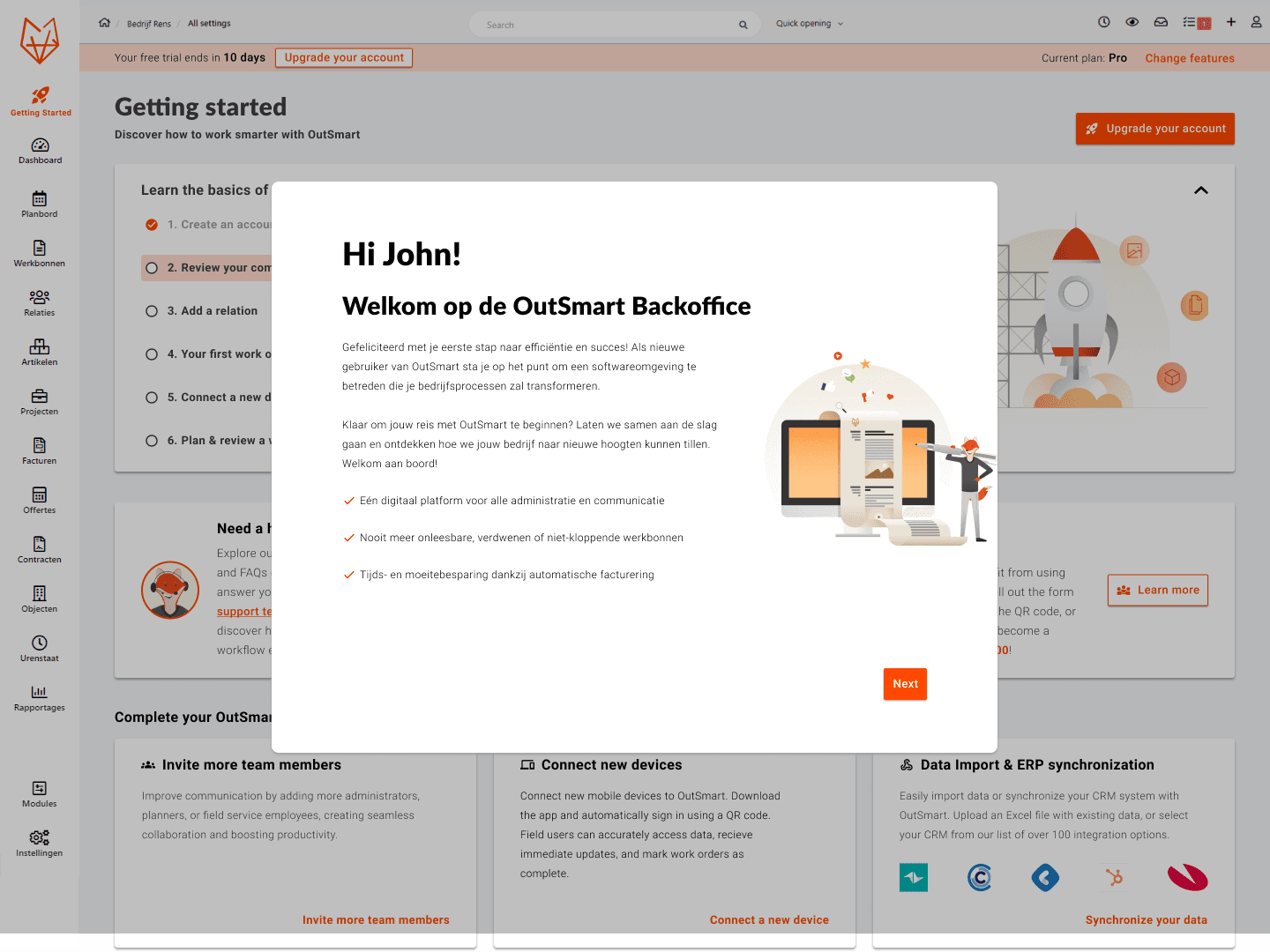
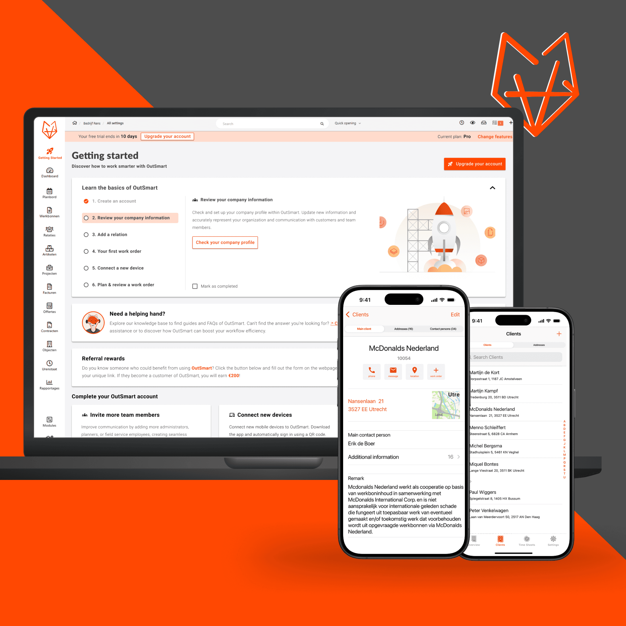
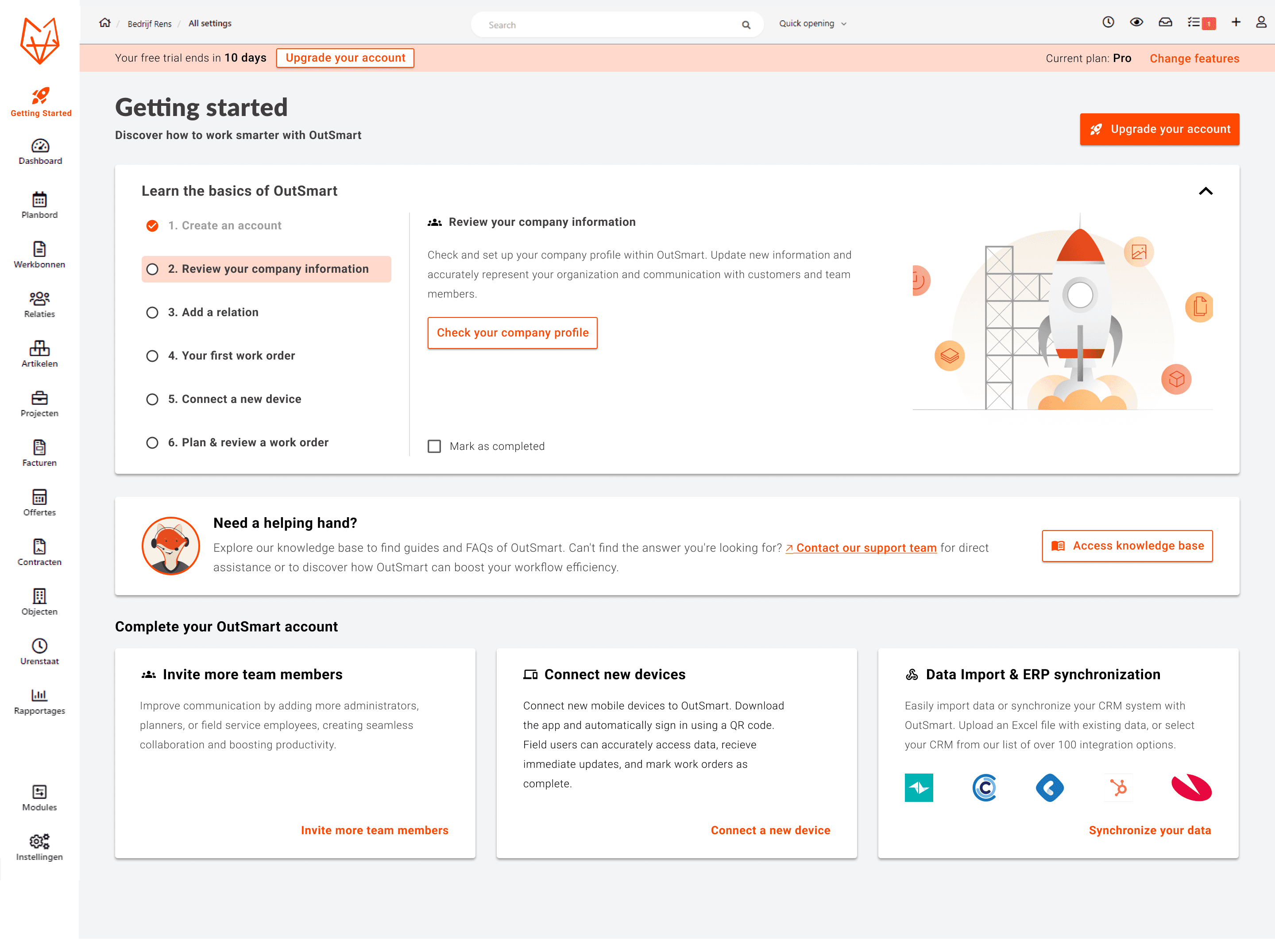
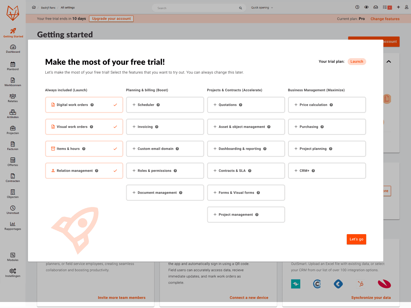
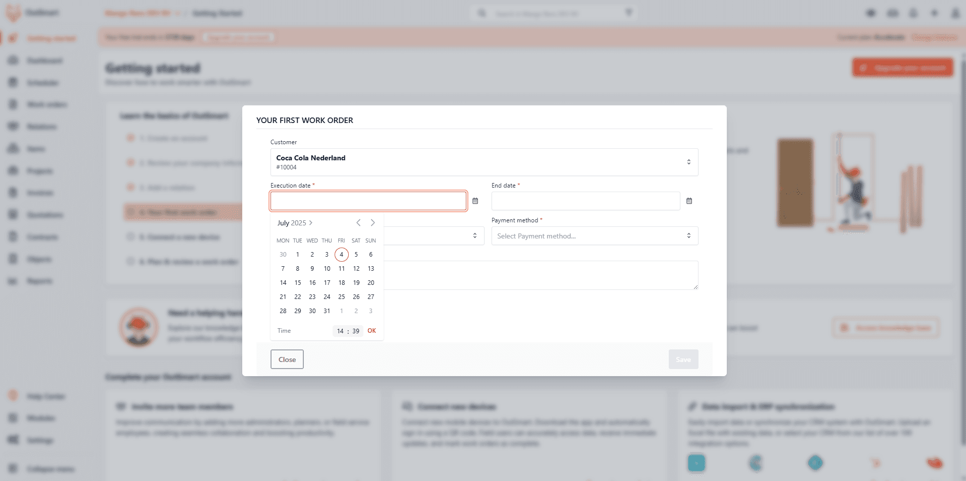
User-to-product onboarding
Once registered, new users previously faced a complex product with little guidance, which left critical features undiscovered and discouraging user retention. We introduced a “Getting Started”-page which included a checklist and several tools to bring users a step-up into setting up their account as well as learning the first steps. This transformed onboarding into a goal‑driven journey: each interaction highlights a prominent feature.
This purposeful structure guided users to activate essential steps in account activation, which improved early-user retention greatly. This 'Getting started' module ensured users experienced OutSmart’s full value before their trial ended.
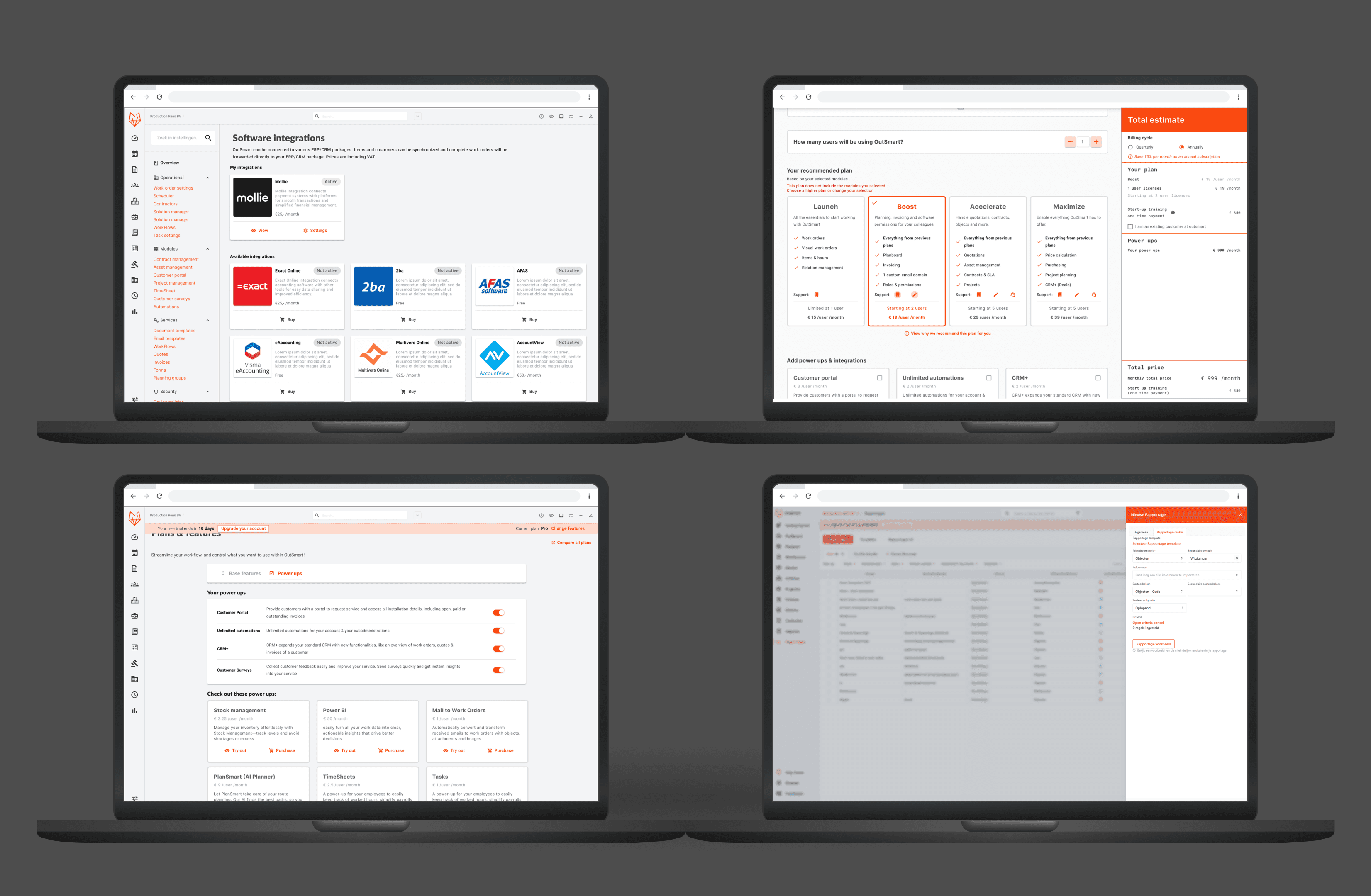
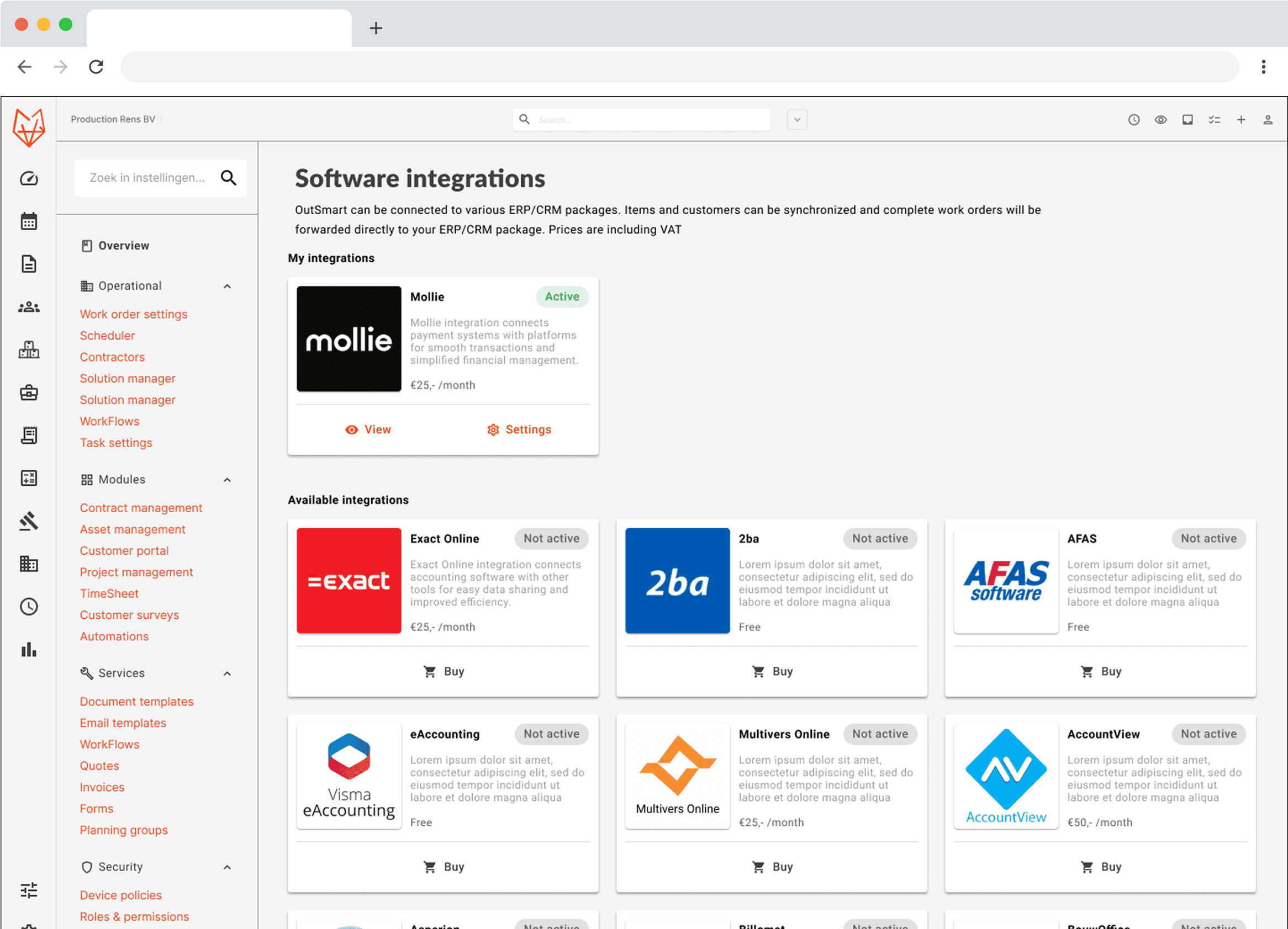
Subscription & feature management
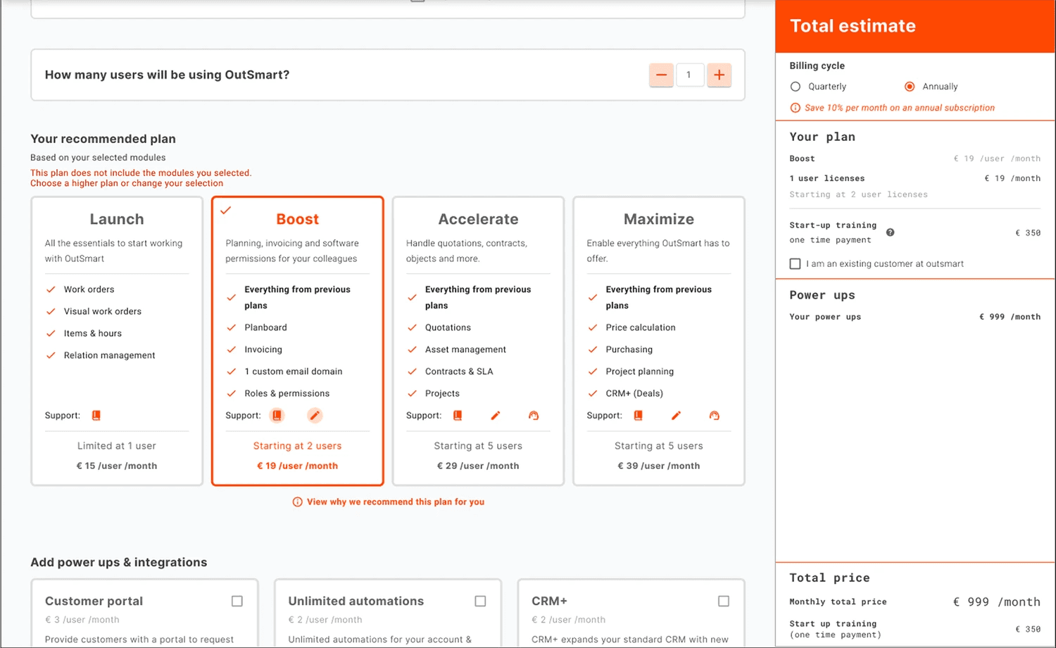
OutSmart’s license manager forced users to navigate multiple disconnected screens to understand their plan, add features, or adjust team size. This created friction and uncertainty at moments of purchases.
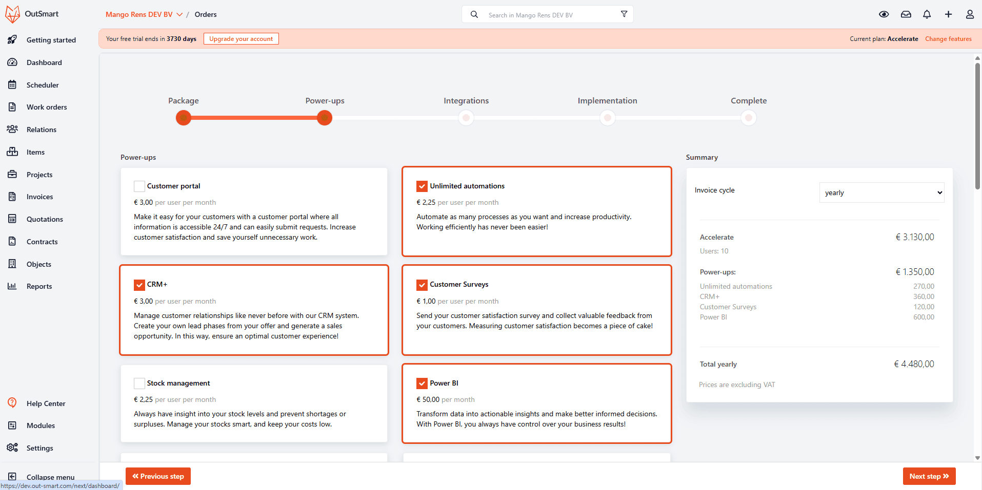
With the introduction of a new pricing structure, the Product Team and I restructured a unified license manager flow centered around new plans and available ''power-ups'. This new flow focused on plan selection, license adjustments, and upgrade options into a single, guided interface. Users can now compare plans side by side, modify their team size, and review available power ups without navigating away from the context of their subscription.
Separate from this, I designed a new Pricing Calculator to help users explore the financial impact of various combinations of plans and power-ups. Instead of static plan overviews, the calculator guides users through plan selection and feature combinations while showing real‑time cost updates.
To complement these systems, we introduced dedicated Power-Up and Integration storefronts. These unified, in-app environments allowed users to discover, compare, and activate power-ups and integrations in one place.
Together, these tools reduce friction, support scalable growth, and give users more control over how they shape their OutSmart environment.
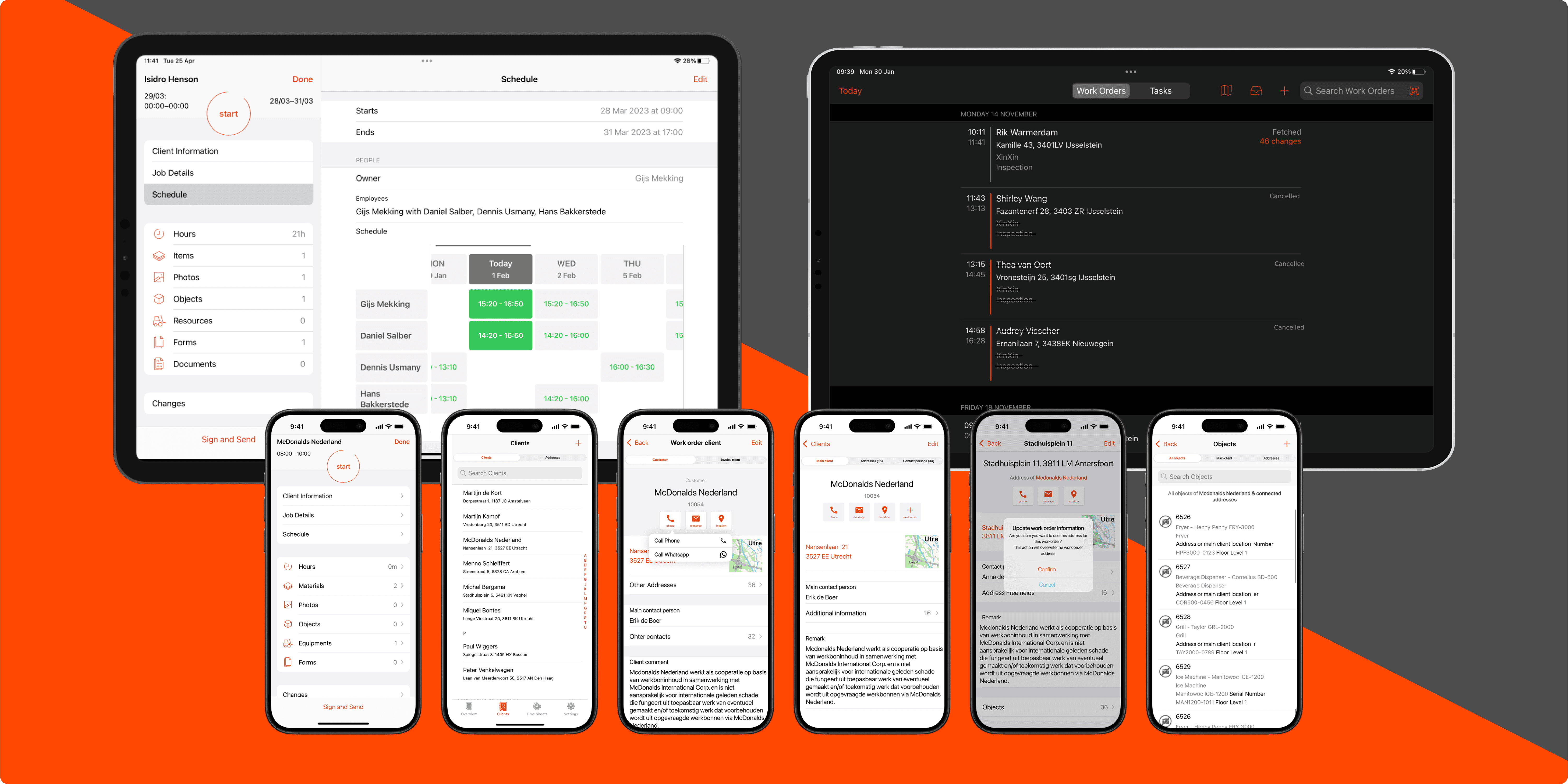
On-site interactions
Field technicians often struggled to complete critical tasks on the original iOS app because key actions were buried in deeply nested menus or behind screen-folds.
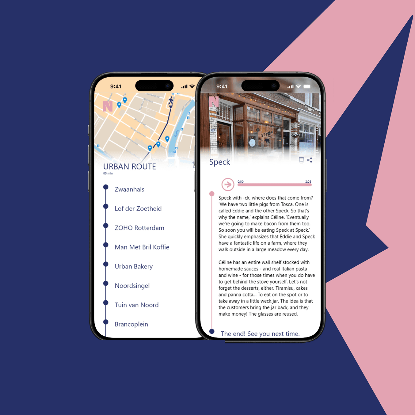
I restructured several screens, as well as the full client profile. The client profile screens turned into a single hub that brings up addresses, contacts, and installation data up front, and places context‑specific actions immediately alongside relevant information. I also introduced gesture‑driven navigations through the app backed by short in‑app tutorials, and standardized iconography for instant recognition.
As a result, field technicians were able to perform essential tasks with a single tap or intuitive gesture, reducing on‑site friction and enabling faster resolution of service calls.

reflecting & outcome
The OutSmart redesign work brought consistency and clarity to a previously fragmented product experience. The new onboarding journey reduced early drop-off, while subscription and reporting redesigns improved transparency and usability. Mobile improvements boosted technician efficiency during fieldwork.
Through each redesign, I aimed to translate OutSmart’s mission—empowering field-service workers—into practical, intuitive design. This project reinforced how end-to-end UX strategy can elevate both business scalability and user satisfaction in complex SaaS platforms.