INDUSTRY:
SOCIAL MEDIA
ROLE
USER EXPERIENCE DESIGNER
SERVICE
USER EXPERIENCE, USER ENGAGEMENT, PERSONALIZATION
TIMELINE
FEB. 2021 - AUG. 2021

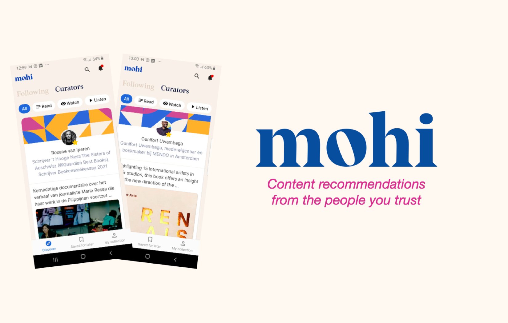
mohi.app
Discover, collect, curate, share
about.
mohi.app is a digital platform designed to bring structure and personal depth to online content sharing, focusing on Slow Media rather than the fast-paced, attention-driven nature of traditional social apps. It allows users to collect, organize, and share meaningful content—articles, books, films, and more—with their inner circle, creating more authentic, intentional and personal digital spaces.
challenge.
During beta testing, MoHi faced three major issues:
Users lacked motivation to post, preferring established platforms like WhatsApp or Facebook.
The app had limited personalization, making it difficult for users to explore content relevant to their interests.
Content organization was confusing, scattered across multiple screens, which complicated revisiting saved recommendations.
How could we motivate sharing, create personalized spaces, and simplify content management and curation while preserving MoHi’s core Slow Media values?
approach.
To address these challenges, I combined attitudinal and behavioral research methods. I conducted user interviews and analyzed feedback from beta testers to understand what users said and felt about their experiences, but also on how they acted. I mapped their journeys based on the interviews to observe and identifying key friction points and opportunities. These insights led me to a redesigned structure and helped me create a more improved navigation structure, which would enhance clarity and engagement. Throughout implementation, I collaborated and iterated closely with stakeholders.

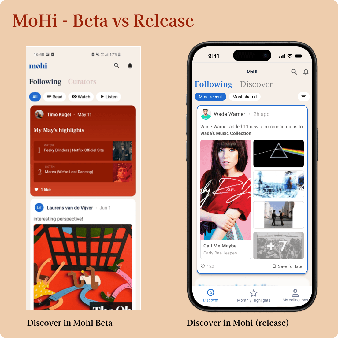
results.
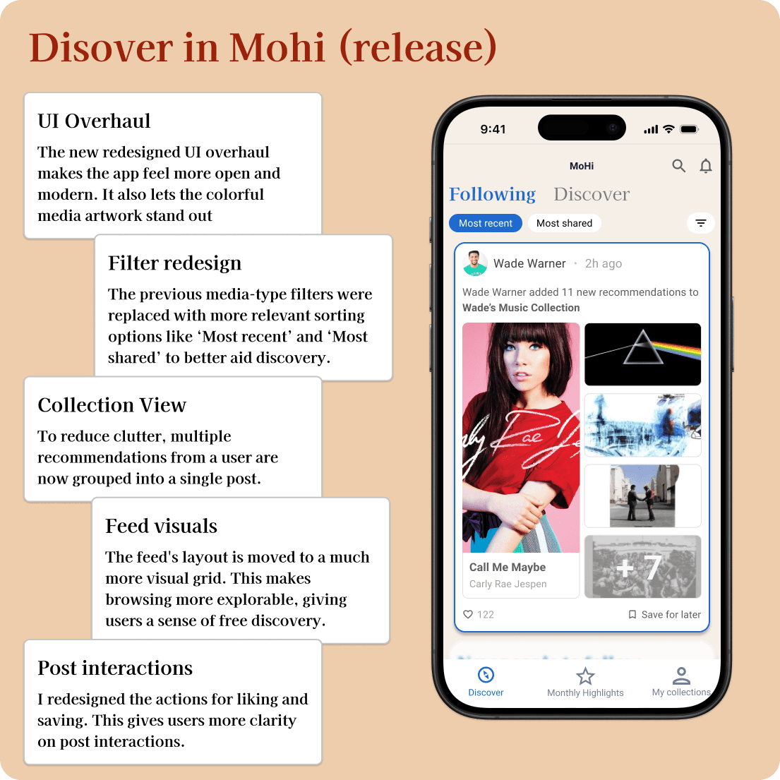
Discover

The home feed initially presented too much posts at once, creating an overwhelming that clashed with MoHi’s mission of slow, deliberate media sharing. Users struggled to navigate through cluttered tabs and ineffective filters, while the separate “Saved for Later” tab pulled focus away from core content.
To bring clarity, I split the navigation to highlight Monthly Highlights and personal profiles, while introducing more relevant, contextual filters in the main feed that is more tailored to individual interests. These adjustments made the feed more approachable and meaningful, leading to increased engagement with featured content.
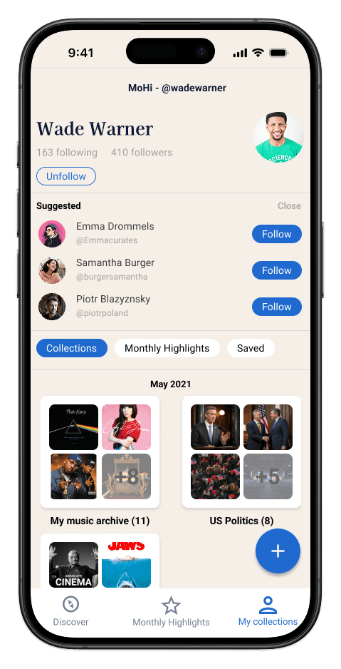
Collect
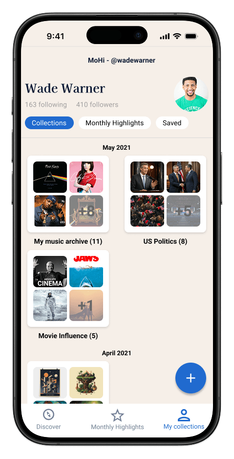
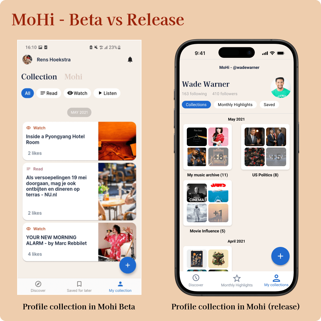
Navigating between different screens to access personal posts, saved items, and highlights disrupted the user experience and hindered content organization.
To solve this, I created a unified “My Collection” area that consolidates all user-curated content into one clear, organized space. This gave users control to group and manage their recommendations easily, transforming their profiles into active, meaningful archives rather than passive logs.

Curate
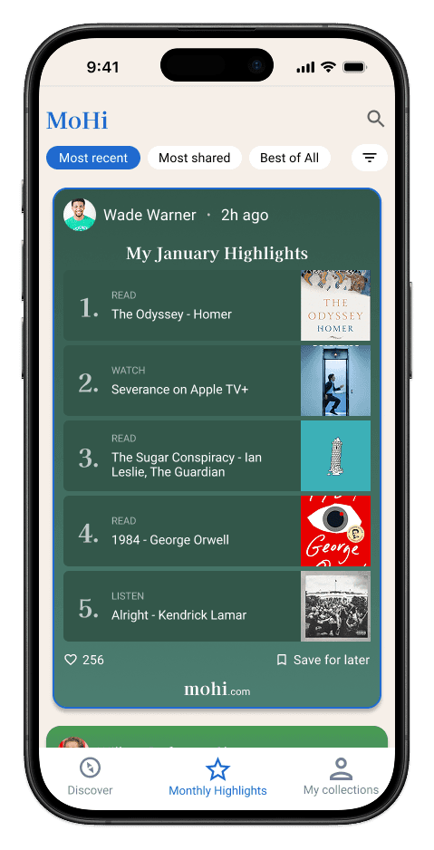
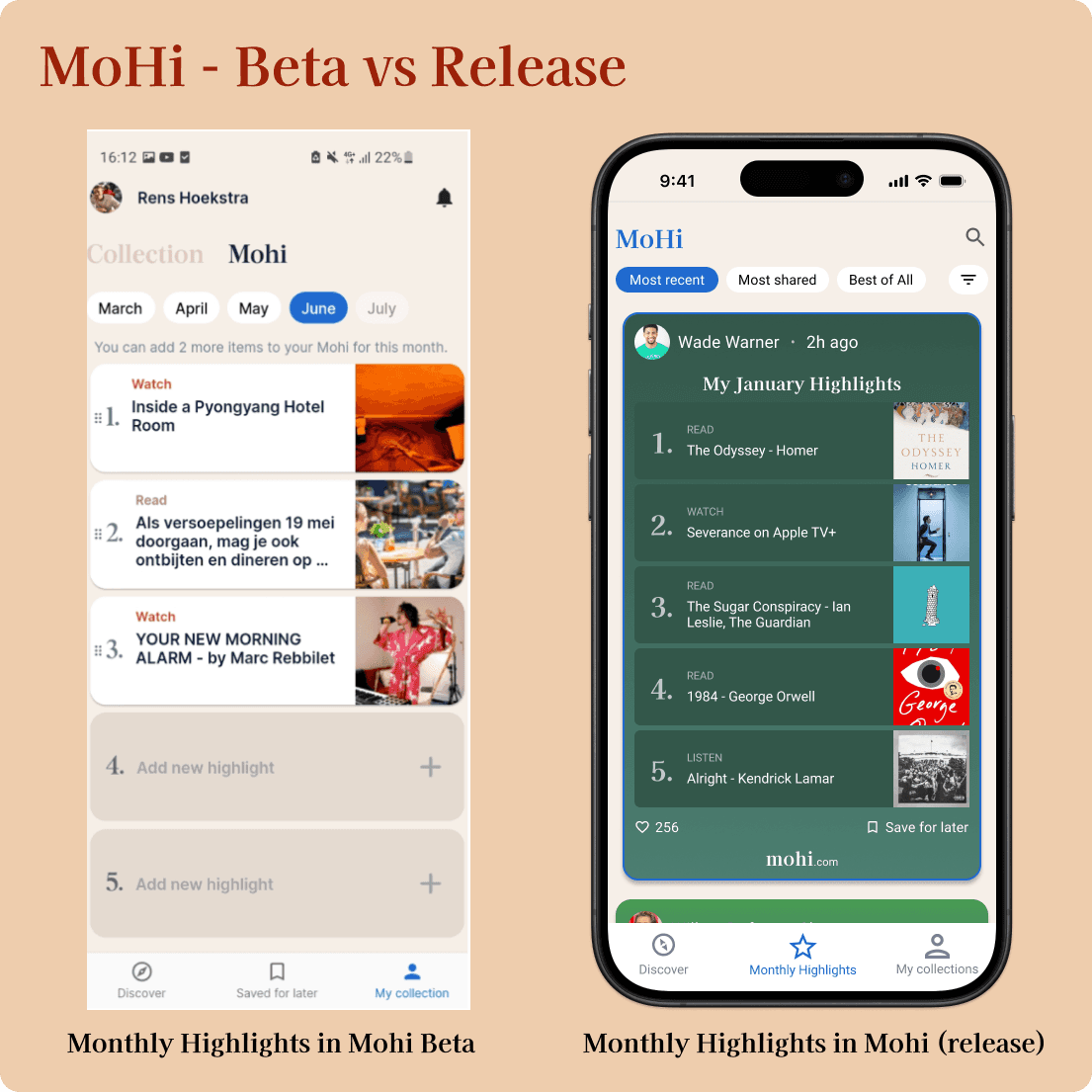
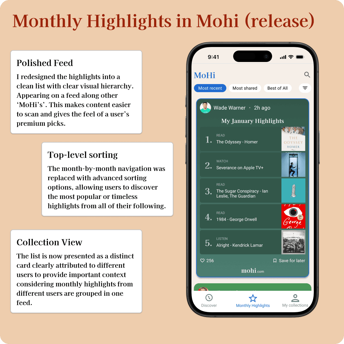
Monthly Highlights, a core sharing feature, lacked a prominent place in the app. They were buried within global feeds. This caused a lot of clutter in the main feed of the app, reducing user engagement on every aspect of the app.
I gave Monthly Highlights a dedicated tab in the main navigation, increasing visibility for every user and encouraging regular engagement on demand. This change brought Monthly Highlights to the center of the user experience which aligned with both user expectation and product vision.
Share
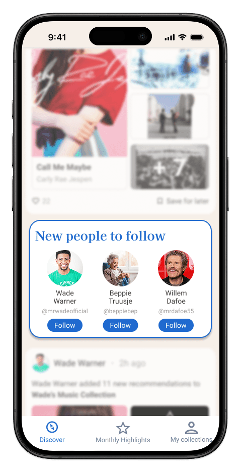
Many users felt isolated as their posts received little visibility, which reduced their motivation to share. To build community and encourage sharing, I introduced 'Contextual User Suggestions' to help users expand their network organically. This increased connection opportunities and amplified post visibility, increasing user engagement and user retention.
reflecting & outcome
Together, these changes helped MoHi move closer to its vision of a slow, intentional media space. By integrating MoHi's values in the navigation users engaged more deeply with the concept of the app. Discovery and filter improvements made exploration feel relevant, while a seperate Monthly-Highligh space empowered users to revisit and share thoughtfully. The introduction of network suggestions fostered a stronger sense of community, motivating ongoing participation. This project reinforced for me how essential it is to align design with a product’s values and user needs. MoHi gave me a lot of experience in diving deeper in bringing value in product strategy through improved user experience.